BRAND IDENTITY DESIGN / PRINT DESIGN
Angela herem


Strategy Overview
Mission
To craft clean, purposeful design that elevates brands and communicates with clarity, intention, and style.
Vision
To be the go-to designer for brands ready to level up, offering modern, strategic visuals that leave a lasting impression and help businesses show up with confidence.
Audience
Entrepreneurs, small business owners, and creative professionals looking for polished, professional design that’s both strategic and visually strong.
Positioning
Angela Herem stands at the intersection of thoughtful strategy and sleek aesthetics, offering a refined design experience that’s equal parts creative and client focused. The brand delivers work that not only looks good but also solves real communication problems.
Brand Personality
Confident but never loud, Detail-obsessed in the best way, Minimalist, but never boring, Professional with a personal touch, Precise, clean, and modern
Design Direction
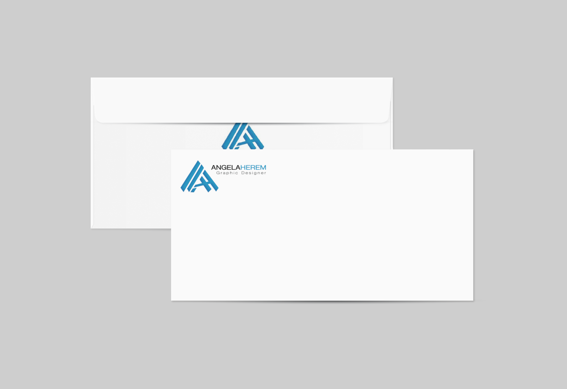
Angela Herem’s visual identity is strong, minimal, and professional, anchored by a stylized monogram and crisp typography.
The logo features the initials "A" and "H" integrated into a dynamic geometric mark, suggesting forward movement and alignment.
A bold black background paired with electric blue accents reflects confidence, clarity, and precision.
The overall aesthetic communicates trust, structure, and modernity, ideal for attracting clients who value design that’s as smart as it is sharp.
Color
Electric Blue #00AEEF Accent color for logos, links, highlights
Charcoal Black #1C1C1C Backgrounds, primary contrast base
Soft White #FFFFFF Clean space for text and layout clarity
Slate Gray #4C4C4C Secondary text, subtle accents
Light Sky #C5E6F8 Optional soft accent or background alternative
This palette reflects clarity, professionalism, and high contrast