BRAND IDENTITY DESIGN / PRINT DESIGN
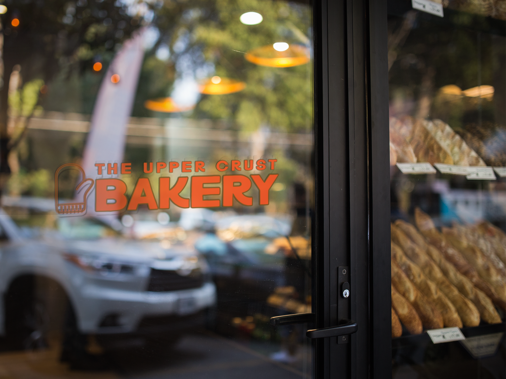
UPPER CRUST BAKERY
About Upper Crust Bakery
The Upper Crust Bakery is where comfort meets craftsmanship. Inspired by classic bakeries and community warmth, we’re all about golden crusts, gooey centers, and recipes that feel like home. Whether it’s a morning cinnamon roll or an afternoon loaf, our baked goods are made to bring people together—with just the right amount of charm.


Strategy Overview
Mission: To bake high-quality, nostalgic favorites that taste as good as they make you feel.
Vision: To be a neighborhood staple both online and in person, where warmth, quality, and personality rise to the top.
Audience: Families, locals, and food lovers who value handmade quality, feel-good flavors, and a brand with heart.
Positioning: Upper Crust Bakery stands out by combining nostalgic aesthetics with modern-day community appeal, baking not just for the moment, but for the memory.
Brand Personality: Warm, cheeky, genuine, and just a little retro.
The Logo Concept
The logo features a bold, rounded typeface in a rich, warm orange grounded by a simple oven mitt icon.
The oven mitt symbolizes comfort, care, and homemade baking, reinforcing the brand's approachable tone.
The word “BAKERY” is prominent and playful, drawing immediate attention while feeling strong and classic.
The outline styling gives it a vintage touch—like a sign painted on an old brick bakery wall.


Color Palette
Warm, inviting, and reminiscent of golden brown baked goods. Used for main logo elements.
A soft, neutral background shade that complements the warmth of orange.
For accents, borders, or secondary fonts, it adds depth and vintage richness.
Clean, simple, and helps everything else shine.
A soft secondary neutral, great for backgrounds and textures.